A foundational overview of how to build a responsive, adaptive, and accessible, multiselect component for sort and filter user experiences.
In this post I want to share thinking on a way to build a multi-select component. Try the demo.
If you prefer video, here's a YouTube version of this post:
Overview
Users are often presented with items, sometimes lots of items, and in these cases it can be a good idea to provide a way to reduce the list to prevent choice overload. This blog post explores filtering UI as a way to reduce choices. It does this by presenting item attributes that users can select or deselect, reducing results and therefore reducing choice overload.
Interactions
The goal is to enable swift traversal of filter options for all users and their
varying input types. This will be delivered with an adaptable and responsive
pair of components. A traditional sidebar of checkboxes for desktop, keyboard
and screen readers, and a <select
multiple>
for touch users.
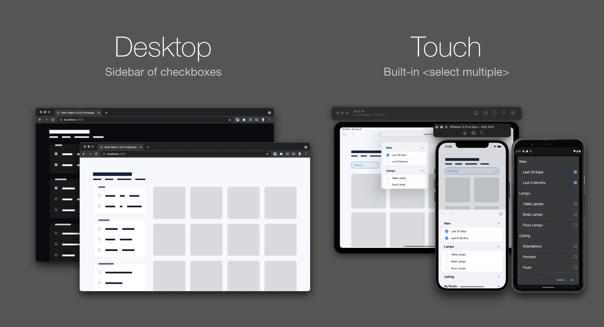
This decision to use built-in multiselect for touch, and not for desktop, saves work and creates work, but I believe delivers appropriate experiences with less code debt than building the entire responsive experience in one component.
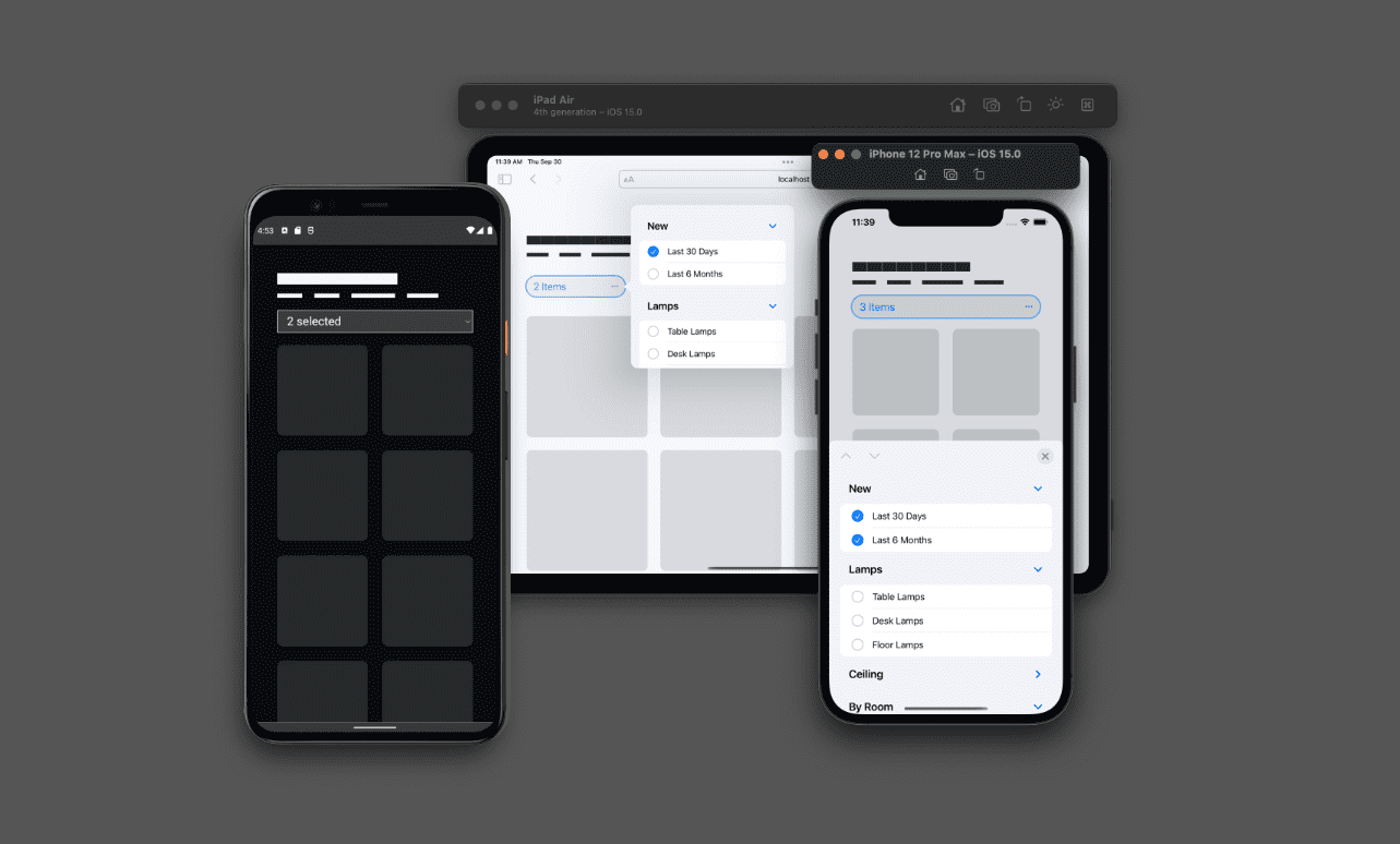
Touch
The touch component saves on space and helps user interaction accuracy on
mobile. It saves space by collapsing an entire sidebar of checkboxes into a
<select> built-in overlay touch experience. It helps input accuracy by showing
a large touch overlay experience provided by the system.
Keyboard and gamepad
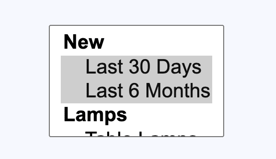
Below is a demonstration of how to use a <select multiple> from the keyboard.
This built-in multi-select can't be styled and is only offered in a compact layout not suitable for presenting a lot of options. See how you can't really see the breadth of options in that tiny box? While you can change its size, it's still not as usable as a sidebar of checkboxes.
Markup
Both components will be contained in the same <form> element. The results of
this form, whether checkboxes or a multi-select, will be observed and used to
filter the grid, but could also be submitted to a server.
<form>
</form>
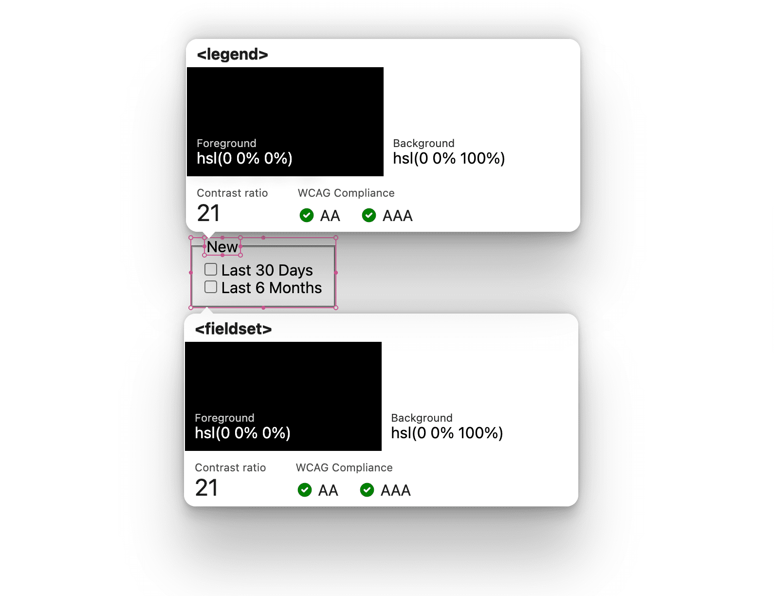
Checkboxes component
Groups of checkboxes should be wrapped in a
<fieldset>
element and given a
<legend>.
When HTML is structured this way, screen readers and
FormData will
automatically understand the relationship of the elements.
<form>
<fieldset>
<legend>New</legend>
… checkboxes …
</fieldset>
</form>
With the grouping in place, add a <label> and <input type="checkbox"> for
each of the filters. I chose to wrap mine in a <div> so the CSS gap property
can space them evenly and maintain alignment when labels go multiline.
<form>
<fieldset>
<legend>New</legend>
<div>
<input type="checkbox" id="last 30 days" name="new" value="last 30 days">
<label for="last 30 days">Last 30 Days</label>
</div>
<div>
<input type="checkbox" id="last 6 months" name="new" value="last 6 months">
<label for="last 6 months">Last 6 Months</label>
</div>
</fieldset>
</form>
<select multiple> component
A seldom used feature of the <select> element is
multiple.
When the attribute is used with a <select> element, the user is allowed to
choose many from the list. It's like changing the interaction from a radio list
to a checkbox list.
<form>
  <select multiple="true" title="Filter results by category">
    …
  </select>
</form>
To label and create groups inside of a <select>, use the
<optgroup>
element and give it a label attribute and value. This element and attribute
value are akin to the <fieldset> and <legend> elements.
<form>
  <select multiple="true" title="Filter results by category">
    <optgroup label="New">
      …
    </optgroup>
  </select>
</form>
Now add the
<option>
elements for the filter.
<form>
  <select multiple="true" title="Filter results by category">
    <optgroup label="New">
      <option value="last 30 days">Last 30 Days</option>
      <option value="last 6 months">Last 6 Months</option>
    </optgroup>
  </select>
</form>
Tracking input with counters to inform assistive technology
The status
role
technique is used in this user experience, to track and maintain the tally of
filters for screen readers and other assistive technologies. The YouTube video
demonstrates the feature. The integration begins with HTML and the attribute
role="status".
<div role="status" class="sr-only" id="applied-filters"></div>
This element will read aloud changes made to the contents. We can update the contents with CSS counters as users interact with the checkboxes. To do that we first need to create a counter with a name on a parent element of the inputs and state element.
aside {
  counter-reset: filters;
}
By default, the count will be 0, which is great, nothing is :checked by
default in this design.
Next, to increment our newly created counter, we'll target children of the
<aside> element that are :checked. As the user changes the state of inputs,
the filters counter will tally up.
aside :checked {
  counter-increment: filters;
}
CSS is now aware of the general tally of the checkbox UI and the status role
element is empty and awaiting values. Since CSS is maintaining the tally in
memory, the
counter()
function allows accessing the value from pseudo
element contents:
aside #applied-filters::before {
  content: counter(filters) " filters ";
}
The HTML for the status role element will now announce "2 filters " to a screen reader. This is a good start, but we can do better, like share the tally of results the filters have updated. We'll do this work from JavaScript, as it's outside what counters can do.

Nesting excitement
The counters algorithm felt great with CSS nesting-1, as I was able to put all the logic into one block. Feels portable and centralized for reading and updating.
aside {
  counter-reset: filters;

  & :checked {
    counter-increment: filters;
  }

  & #applied-filters::before {
    content: counter(filters) " filters ";
  }
}
Layouts
This section describes the layouts between the two components. Most of the layout styles are for the desktop checkbox component.
The form
To optimize legibility and scannability for users, the form is given a maximum
width of 30 characters, essentially setting an optical line width for each
filter label. The form uses grid layout and the gap property to space out the
fieldsets.
form {
  display: grid;
  gap: 2ch;
  max-inline-size: 30ch;
}
The <select> element
The list of labels and checkboxes both consume too much space on mobile. Therefore, the layout checks to see the user’s primary pointing device to change the experience for touch.
@media (pointer: coarse) {
  select[multiple] {
    display: block;
  }
}
A value of coarse indicates that the user will not be able to interact with
the screen with high amounts of precision with their primary input device. On a
mobile device, the pointer value is often coarse, as the primary interaction
is touch. On a desktop device, the pointer value is often fine as it's common
to have a mouse or other high precision input device connected.
The fieldsets
The default styling and layout of a <fieldset> with a <legend> is unique:
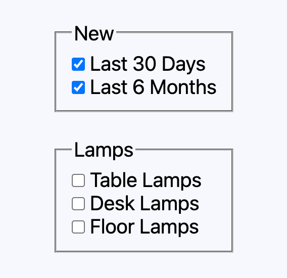
Normally, to space my child elements I'd use the gap property, but the unique
positioning of the <legend> makes it difficult to create an evenly spaced set
of children. Instead of gap, the adjacent sibling
selector and
margin-block-start are used.
fieldset {
  padding: 2ch;

  & > div + div {
    margin-block-start: 2ch;
  }
}
This skips the <legend> from having it's space adjusted by targeting just the
<div> children.
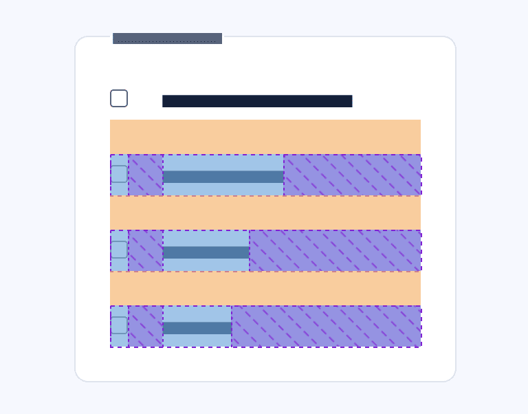
The filter label and checkbox
As a direct child of a <fieldset> and within the max width of the form's
30ch, label text may wrap if too long. Wrapping text is great, but
misalignment between text and checkbox is not. Flexbox is ideal for this.
fieldset > div {
  display: flex;
  gap: 2ch;
  align-items: baseline;
}
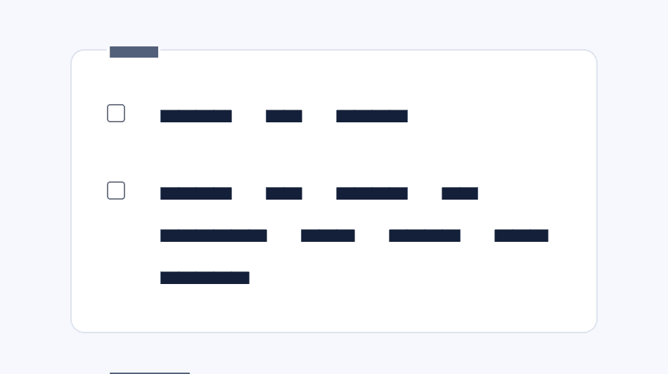
The animated grid
The layout animation is done by Isotope. A performant and powerful plugin for interactive sort and filter.
JavaScript
In addition to helping orchestrate a neat animated, interactive grid, JavaScript is used to polish a couple of rough edges.
Normalizing the user input
This design has one form with two different ways to provide input, and they don't serialize the same. With some JavaScript though, we can normalize the data.
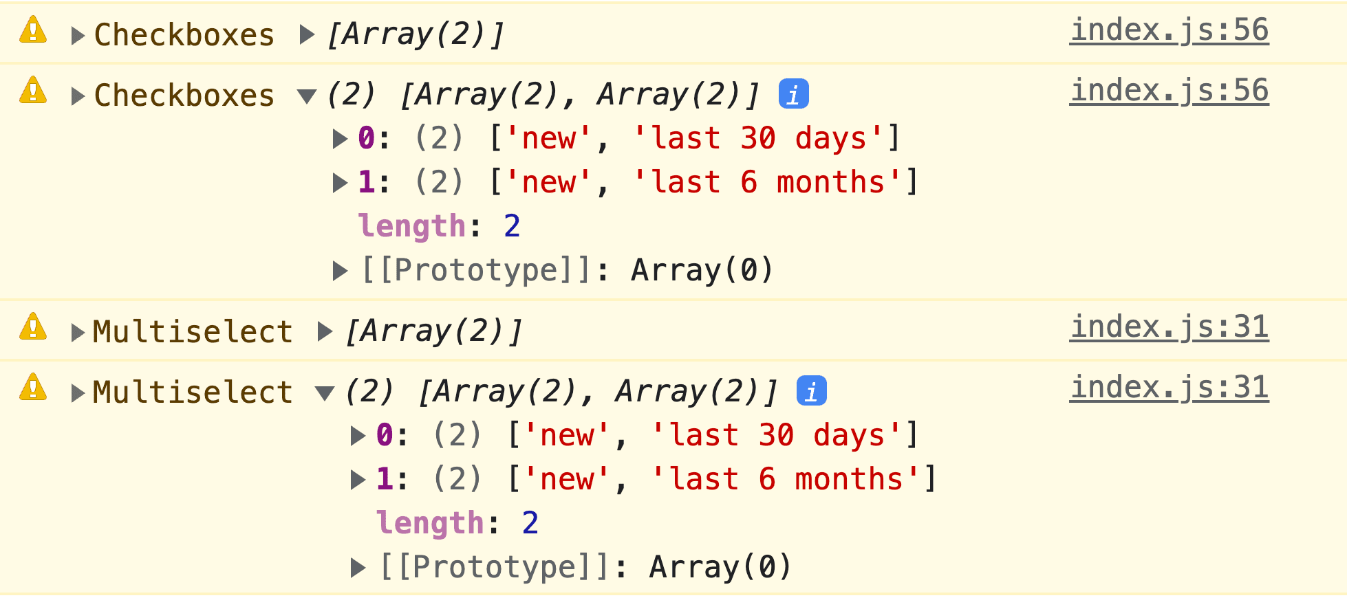
I chose to align the <select> element data structure to the grouped checkboxes
structure. To do this, an
input
event listener is added to the <select> element, at which point it's
selectedOptions
are mapped.
document.querySelector('select').addEventListener('input', event => {
  // make selectedOptions iterable then reduce a new array object
  let selectData = Array.from(event.target.selectedOptions).reduce((data, opt) => {
    // parent optgroup label and option value are added to the reduce aggregator
    data.push([opt.parentElement.label.toLowerCase(), opt.value])
    return data
  }, [])
})
Now it's safe to submit the form, or in the case of this demo, instruct Isotope on what to filter by.
Finishing the status role element
The element is only tallying and announcing filter count based on checkbox
interaction but I felt it was a good idea to additionally share the number of
results and ensure the <select> element choices are counted as well.
<select> element choice reflected in the counter()
In the data normalization section, a listener was already created on input. At the end of this function the number of chosen filters and the number of results for those filters are known. The values can be passed to the state role element like this.
let statusRoleElement = document.querySelector('#applied-filters')
statusRoleElement.style.counterSet = selectData.length
Results reflected in the role="status" element
:checked provides a built-in way of passing the number of chosen filters to
the status role element, but lacks visibility to the filtered number of results.
JavaScript can watch for interaction with the checkboxes and after filtering the
grid, add textContent like the <select> element did.
document
  .querySelector('aside form')
  .addEventListener('input', e => {
    // isotope demo code
    let filterResults = IsotopeGrid.getFilteredItemElements().length
    document.querySelector('#applied-filters').textContent = `giving ${filterResults} results`
})
Altogether this work completes the announcement "2 filters giving 25 results".

Now our excellent assistive technology experience will be delivered to all the users, however they interact with it.
Conclusion
Now that you know how I did it, how would you‽ 🙂
Let's diversify our approaches and learn all the ways to build on the web. Create a demo, tweet me links, and I'll add it to the community remixes section below!
Community remixes
Nothing to see here yet!

